2011年4月22日 星期五

the London original print fair

Yesterday, 21/04/11, I went to see the exhibition "the London original print fair" at Royal Academy of Art.
The exhibition is so amazing, it has so many famous artists and designers' art work.
To me, the most famous designers/artists in there are Andy Warhol and Pablo Picasso,
there are many artworks from them,
but after this experience, I knew other famous and talent designers.
I started trying to sketch the works instead of using cameras,
I realized that sketching could remind me what I see more.

I saw many interesting prints i like, especially some designers' works.
This one is Pablo Picasso's art, the note says that it's original etching, which is really cool.


This image is made by Damien Hirst, my favorite designer in these artworks of exhibition,
the image is simple but colorful, some of other prints are really interesting,
I will go to check this designer in the future. 

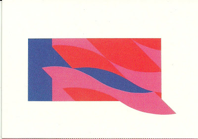
This one is made by Bridget Riley, using screen print in colors.
It reminds me the patterns i had done in the project of ditto press.
I'll look up the designer as well.

The third one....it's a shame that i didn't know he is also a famous graphic designer at first,
my friend told me about him, Roy Lichtenstein, his style is really obvious that my friend can say his name directly when she saw this postcard i bought,
so I think there are so many research I have to do.

After seeing this exhibition, I realized that those designers could make the printing skills so well,
even it's much harder than doing in this generation,
I have to be better, be more creative,
 so one day, maybe my artworks could be sold in a large price like them,
such as the chicken soup can by Andy Warhol, the image cost about 16000 ponds.

so, again, run Mikey! run!


2011年4月6日 星期三

darkroom plus scanning

this monday was the first day of our spring break,
i knew school didn't on the break now,
so i went there to develop some black/white and scan some color photos.
in fact, this was my first time developing B/W film, i used to develop color films,
i thought it should be no difference between using B/W film and color film into B/W photo,
but after this time, i realized that it is much harder to develop color film into B/W photos
because color film has three layers of colors: red, green and blue, 
it will cost the image hard to make the clear contrast and light.
On the other hand, B/W film doesn't have this problem, so it's much easier to develop.
So, here are the photo I developed on monday:


In the same day, after finishing developing photos,
 i also went to computer room to scan some color images,
the scanner is so slow that it takes about 10 mins for 3 images only,
it is a work which need many time and patience.
but the outcomes are great, i used my Lomography camera took photos,
because of the camera, the color of images are really pop-out,
it's so cool!! take a look!


2011年4月4日 星期一

typography workshop

last friday,1st of april,
i took the workshop of typography by jo.
The brief is :
Using typography you will be developing the use of
 emphasis within a London poem or song, which will be provided.
 You will be exploring the use space, size and weight within a set shape.
I choose Lilly Allen's LDN
I was trying to use only text to create a image like CD cover,
at first I couldn't find any idea or inspiration,
but i still made one first for experiment:

to me, it's no reason and not interesting for me to make like this,
later, I thought that why not searching this song and taking a listen?
so i did:


The music is quite happy, 
so if it has to be the cover of it, 
the image should be suitable.
then i started playing around,
i even put the lyrics of the song on the top
 to try to make some un-normal ways which the feelings of songs of Lilly Allen give me.


2011年4月3日 星期日

29/03/11 mono print

last tuesday, i took the workshop of mono print.
Using a metal board with inks, and tracing on a paper from a image by hands,
maybe it's the teaching of the tutor, i felt boring at first,
but after i started doing mine and looking at others',
i got interesting with this work.
though people used the same images to trace,
 the outcomes are totally different from each other,
maybe it's because people focus on different part of the image even it is the same one.
the outcomes are surprisingly good,
so, here they are mine: 


2011年4月2日 星期六

Texture - Unseen

last friday, 25th of march
i joined jo's workshop
which is called Texture - Unseen
the brief is:
Using 2 allocated words,
 you will be collecting visual representations of the textures described. 
What textures can you find which don’t adhere to the stereotypes of London,
 Look at representing London in a new light.
the two words we got are "sharp"and "wrinkly"
we took the photos of plastic bags and the arrow of the uni's wall.
the outcome is quite nice in our group,
and others are great as well,
but i was surprise that Jo didn't give us many directions, 
just left us start doing.
anyway, here are the outcomes of ours.